 |
| Scene From Music Video |
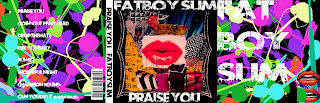 |
| Album Cover |
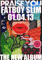 |
| Music Poster |
In order for my products to look successful together, i needed to create a particular 'house style' to ensure my audience was aware that my three products were linked and advertising the same product.
FONTS:
I used the same font type for both my music poster and album cover:
 |
| Font type that i used for my products |
As you can see, both are
white and all capital letters. This ensures it is clear, simple and eye-catching. As i didn't want the text to be lost amongst all of the colour used as the background.
I also used, for my introductory scene to my music video, a similar white text on black background. As the contrast of colours appear almost 'electronic' and cartoon-like, which helps to connote my genre of 'electronic/funk'. As this text was shown in a quick-paced stop-motion animation scene, i therefore felt it was vital to ensure that it was a clear. simple and bold font such as the one i have used here.
COLOURS:
Throughout all three products i made very sure to include a huge amount of strong, bright colours. This was to help give the connotations of my music genre, as the colours i included are all positive and happy colours and therefore, reflect the energetic, exciting song i chose and moreover, the genre of my music video. I therefore, made certain to avoid any dark negative colours- with the exception of the black background used for the three products, as this was only so that the colours and white font could be accentuated and clear.
These bright colours can be seen in the collage of patterns used on my poster and cover and through the costume, makeup, lighting, scenery and special effects that i used throughout my music video. Furthermore, the use of bright colours also reiterated to my audience that my genre is to uplift and ignite positive emotions.


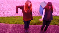 |
| Screen Shots of the 'collage-like' lighting effects I included in my video: |
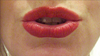
'LIPS' MOTIF:
The image of the lips was of particular importance throughout my three products. This reoccurring motif/image helped me to bring a certain link between the three products. Corresponding with the theme of my music video, as a main feature of the production was the lip-synching of the lyrics and the collaboration of extreme-close up shots of the lips.
Here is a quick section of my music video that I selected using,
http://www.tubechop.com/. It shows the repetition of the extreme-close-up shots of the lips that I compiled together. This links with my main focal point in the centre of my album cover and the centre of my music poster.


